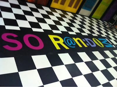
Recently, @BrandonSmithCEO, A.K.A. Brandon Mychal Smith of Sonny With A Chance, Tweeted the above picture of the new logo for So Random! By the looks of it, the actual set hasn't changed that much, but the logo has changed a lot from the first and second seasons.
 |
| Season 1 |
 |
| Season 2 |
 |
| Season 3 |
While we like this new logo, we have to say that we still like last season's better. What are you thoughts? Tell us in the comments!

No comments:
Post a Comment